|
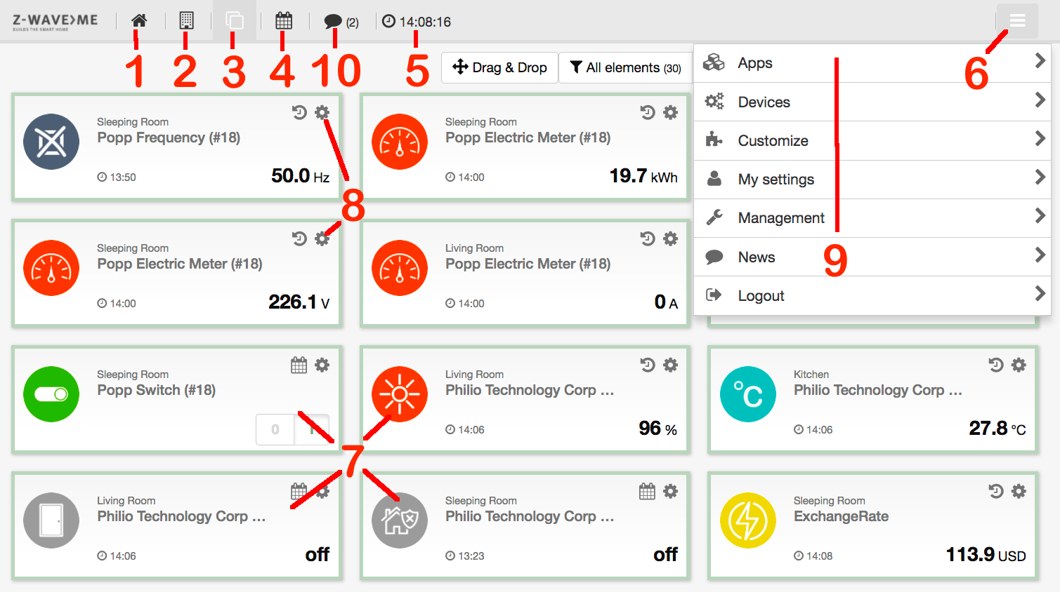
A screenshot overview is shown in Figure 4.1 marking the essential parts of the interface. It looks similar on different devices such as a desktop PC, smartphone, and tablet (both native app and browser), but will adapt to the screen size.
The Z-WAY SMART HOME INTERFACE follows some very clear logic thats was developed by Prof. Christian Paetz and presented the first time on the Smart Home Summit 2014 in Munich/Germany.
The following basic rules apply:
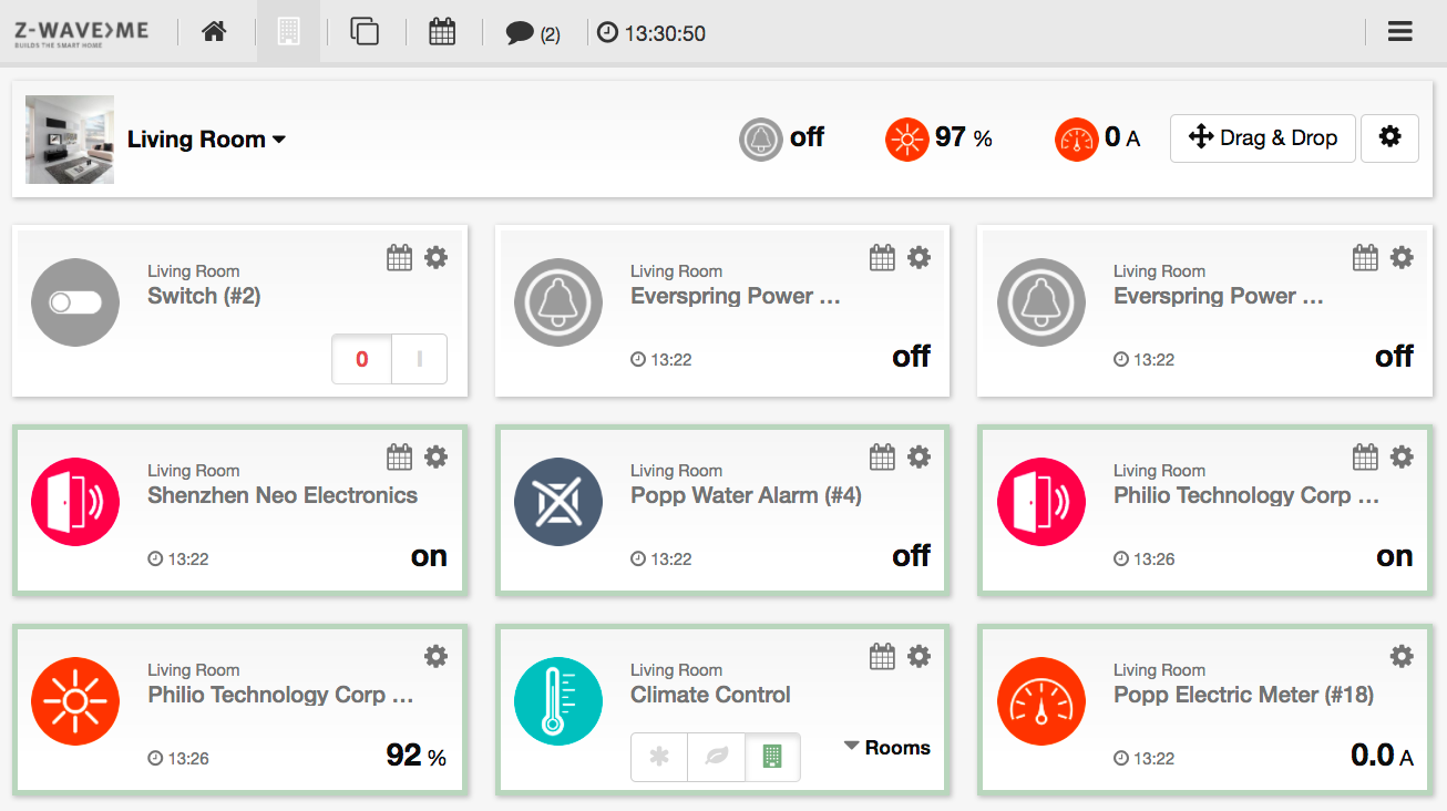
Figure 4.1 shows the standard element view of the Z-WAY SMART HOME INTERFACE . Elements with an icon, buttons, or variables are placed side by side. Depending on the screen size, they are grouped in one (mobile phone), two (pad), or three (PC screen) columns.
The very same display is available on the Dashboard (No. 1), the Room View (No. 2), and the Element view (No. 3). The element view shows all elements (No. 7) available while the dashboard shows elements that where manually selected for display on the dashboard. The clock on the topline menu (No. 5) shows the actual time in the time zone of the gateway (not the actual position of the browser). The elements can be filtered by element type or can be ordered by
The button Drag-and-Drop turns the user interface in a reordering mode. Just drag and drop elements to reorder them. After the new order is saved, it is available as 'custom'. The same logic can be applied to all view showing elements (Element View, Dashboard, and Room View).
A search field allows searching for given names of the elements.
All elements can be assigned to “tags’’: Tags are text blocks that can be arbitrarily chosen. Typical tags are “Temperatures,’’ “Energy,’’ and “Outdoor.’’ Multiple elements can have the same tag and one element can have several tags. By selecting a tag, only elements are shown that are tagged with this name.
Tags are managed on the element configurations described below.
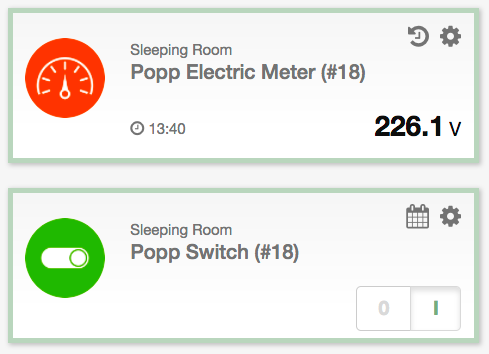
Figure 4.2 shows two typical elements: Each element has a given name. This name may refer to the function or the position. Please make sure to keep the name short enough so that no display problem is created. Each element also has one or several icons. In case the element represents an actor function, the icon usually refers to the switching state of the actor (on or off, up or down). Changing icons also indicate the status of binary sensors such as motions detectors. Analog sensors typically only have one icon. The upper element is an actor allowing to be switched on and off.
The  (No. 8 on Figure 4.1) on
the right-hand side opens the element configuration dialog. The symbol left to the configuration
wheel depends on the type of device. For devices with analog values such as rain sensors,
temperatures, etc., the icon
(No. 8 on Figure 4.1) on
the right-hand side opens the element configuration dialog. The symbol left to the configuration
wheel depends on the type of device. For devices with analog values such as rain sensors,
temperatures, etc., the icon  will
open a 24-hour history of the sensor value. Devices
with 24-hour history also show a time stamp when the last value update was received.
Clicking on the large icon itself will call for a value update, but please keep in mind
that battery-operated devices will only send updated values after the next wakeup.
For event-driven devices such as actuators or binary sensors, an icon
will
open a 24-hour history of the sensor value. Devices
with 24-hour history also show a time stamp when the last value update was received.
Clicking on the large icon itself will call for a value update, but please keep in mind
that battery-operated devices will only send updated values after the next wakeup.
For event-driven devices such as actuators or binary sensors, an icon
 will show a list
of the last 10 events with the time stamp. One click away is then the full list of
events, as described in Section 4.1.1, but filtered for this element.
will show a list
of the last 10 events with the time stamp. One click away is then the full list of
events, as described in Section 4.1.1, but filtered for this element.
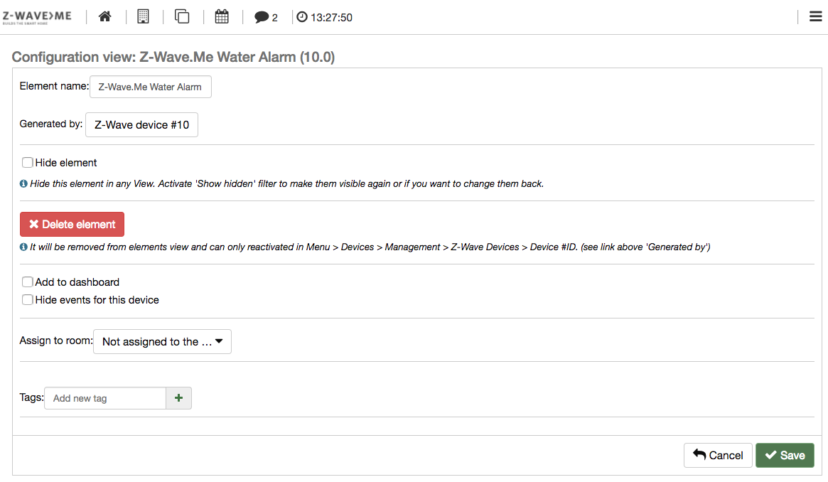
Every element shown has its own configuration dialog (No. 7 on 4.1). Clicking
on the symbol on the upper right-hand
side opens this dialog.
Figure 4.3 shows the upper part of the element configuration dialog.
The element name is the given name of the element. Z-Way tries to automatically find a reasonable name, but the user should change this name according to the specific setup of the home.
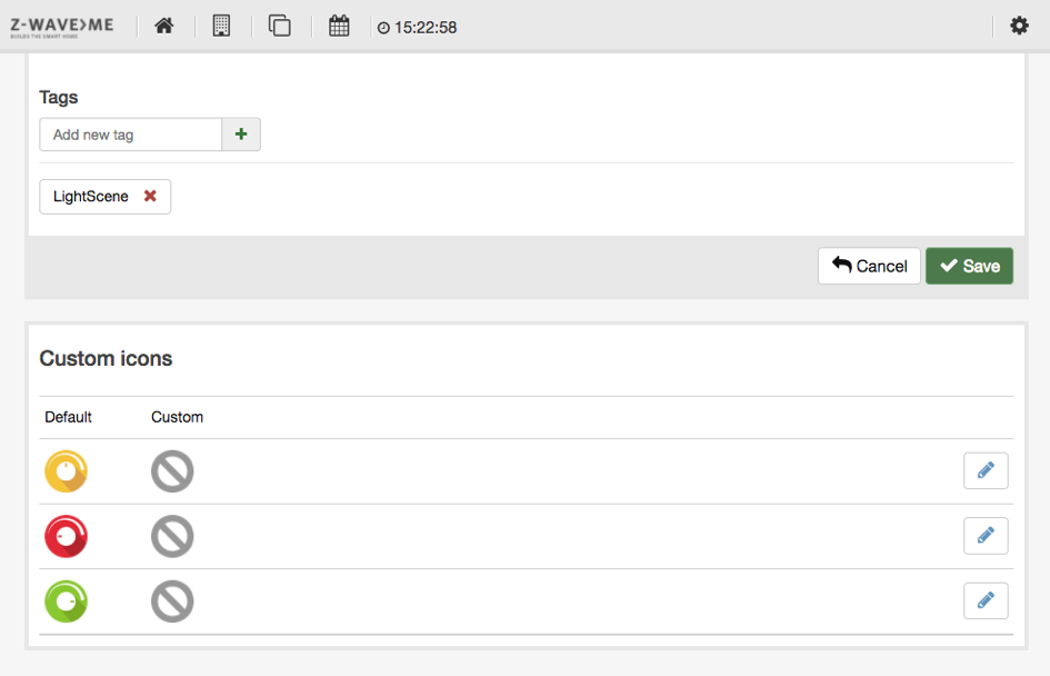
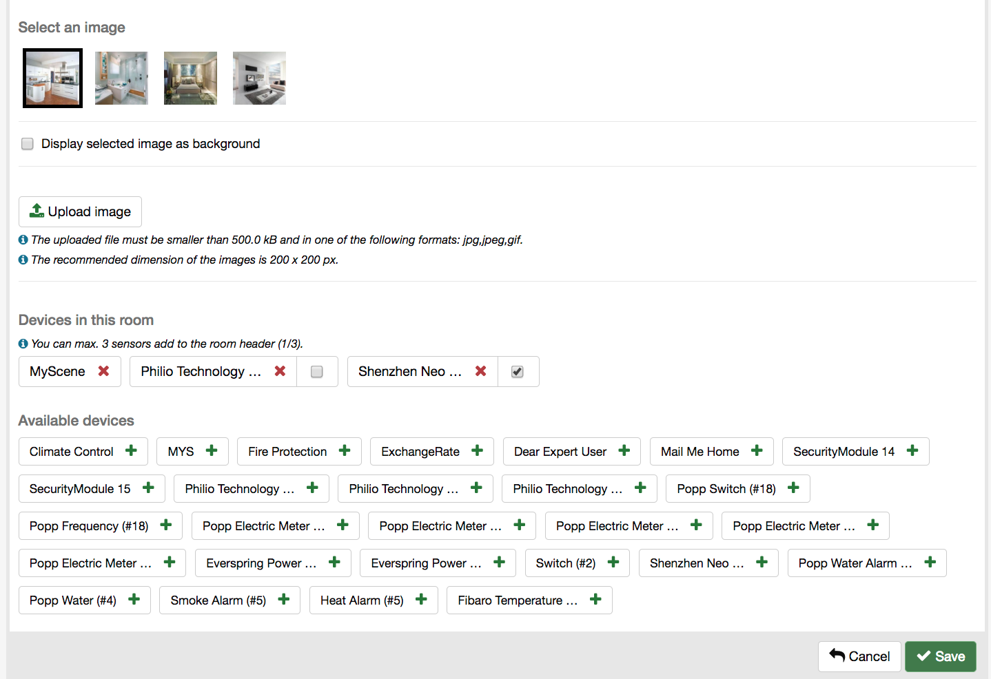
Figure 4.4 shows the lower part of the element configuration dialog. The tag option allows setting and removing tags. When a tag name is inserted into the text field, it autocompletes known tag names.
The custom icon sub-dialog allows changing the icons of the element. Each element has one, two, or three icons depending on the status indicated. Each of the icons can be replaced by an own individual icon. Just click on the pencil button to change the icon. To download more icons, refer to the customization section in the configuration menu.
The Z-WAY SMART HOME INTERFACE allows managing different rooms and assigning elements to rooms. Each element can be placed in one room only.
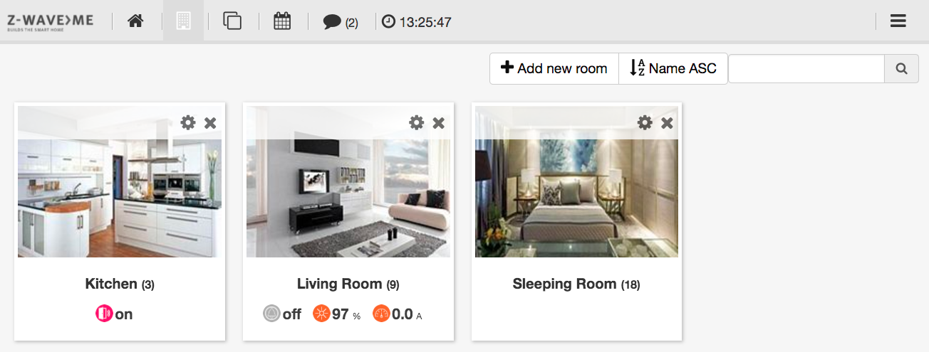
Clicking on the room symbol on the top menu opens the room view with a list of rooms, as shown in Figure 4.5.
Each room has its own element with a background image that can be configured. It is possible to add new rooms using the button labeled Add room. The room is named and the number of elements in this room is shown. Per room there are up to three sensors that can be selected as “quick-view sensors’’. They are shown right below the name and in the top menu in the individual room view.
Clicking on the room element leads to the room view, as shown in Figure 4.6.
The room view lists all the elements in the room. As in the element view, they can be re-arranged using the drag-and-drop feature.
The top line shows up to three quick sensors and allows quick change of the room using the dropdown list. If your browser supports gestures, you can change the rooms by swiping left or right.
Clicking on the symbol of the
room element or inside the room view in the top line opens the room configuration
dialog, as shown in Figure 4.7.
Each room can have an individual name. Besides some pre-installed images, it is possible to upload images for the room. A checkbox defines the room image that is used as a background image in the room view.
The dialog allows assigning elements to this room which were not assigned to any room yet. Just click on the element name in the list of Available devices.
The little checkbox on the right-hand side allows selecting up to three sensors as “quick-view sensors’’.
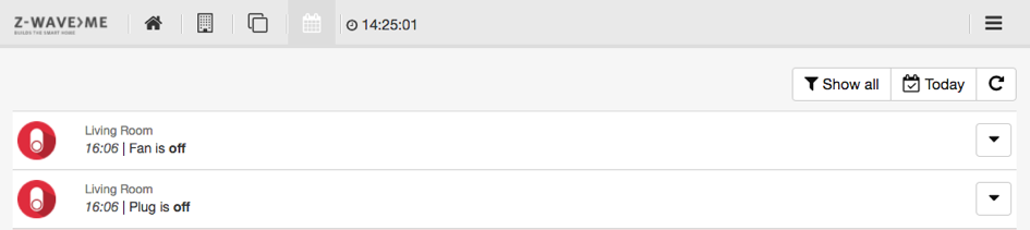
The event timeline is the forth menu item in the top menu.
The timeline dialog offers a chronological view of the events in the Smart Home. The events are:
The standard view of the timeline, as shown in Figure 4.8, lists all events with the icon of the element, room info, time stamp, name of the element, and status info. Every line item has a context menu on the right-hand side. This menu allows
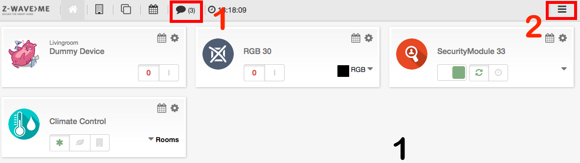
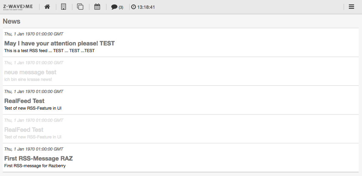
Each Z-Way controller is connected to an RSS feed. This feed contains news and alerts about the platform. Whenever there is a new feed entry, the top menu bar will indicate this with a sign, as shown with Marker 1 in Figure 4.9. Clicking on this opens the full list of news. This full list can also be accessed using the 'News' menu item in the configuration section, as described in Section 4.2.5.
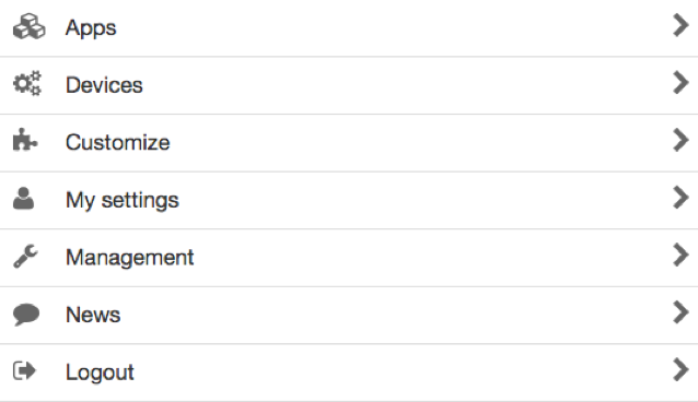
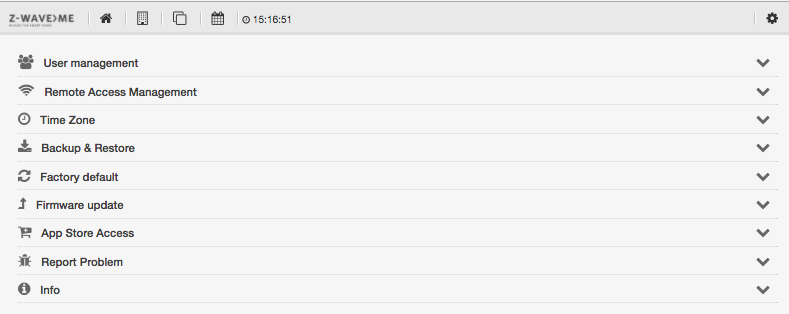
Clicking on the menu item (marked as No. 2 in Figure 4.9) on the right-hand side opens the configuration menu. The configuration offers various functions to enhance and configure the smart home system as such and the user interface. Figure 4.10 shows the configuration menu of Z-Way.
This menu option allows managing the home automation applications and interfaces of Internet or IP-based services or devices.
Z-Way apps are like software applications that use the infrastructure of the Z-Wave network to provide application solutions and dependencies. These software applications also extend the capabilities of the network and implement automation functions.
Like any other application software such as those for PCs, some Z-Way apps are preinstalled on the device, and others can be downloaded and installed by the user. Like application software, some software solutions can only run once while others can be started multiple times.
The app menu has three parts:
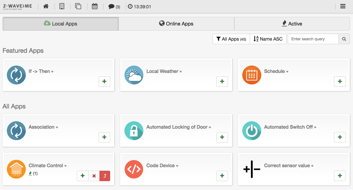
The list of local apps, as displayed in Figure 4.11, shows a small subset of apps that are already on the local devices. The top part shows some of the apps that are most frequently used (featured apps). A filter allows filtering for certain app types; ordering and direct search in the search box also help to find the right app. If there are active instances of the app (software running x times with different parameters), this is indicated right below the name of the app.
Clicking on the name will open a dialog with further information about the app. Clicking on the + button will lead right to the configuration page of the app.
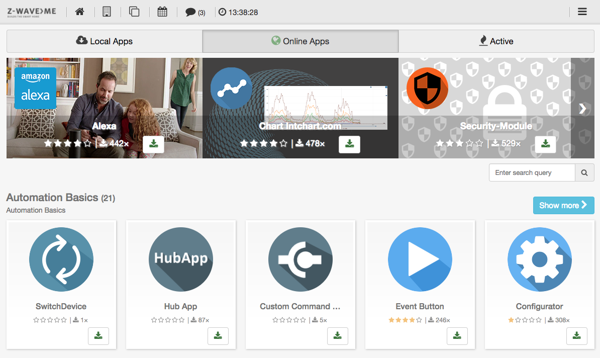
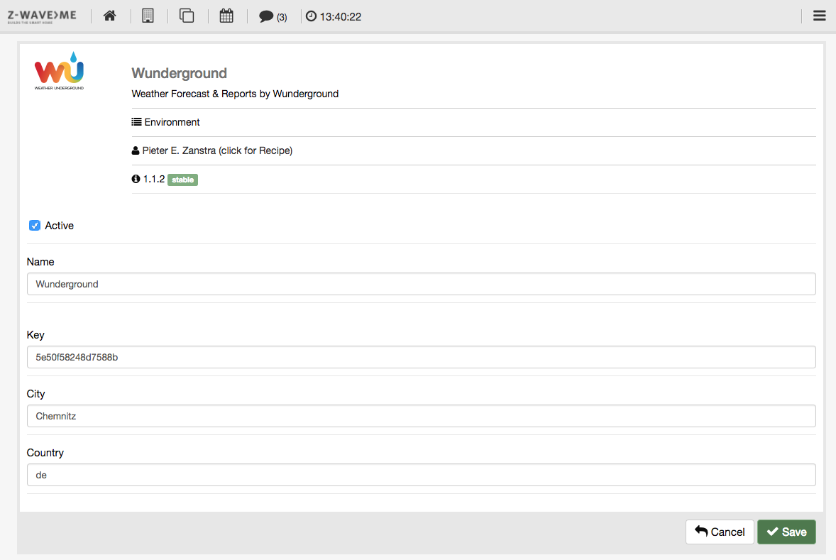
The online app list, as shown in Figure 4.12, offers the same functions. However, apps need to be downloaded first before they can be configured and started. Clicking on the download button will copy the app to the local repository and start the configuration dialog, as shown in Figure 4.13.
Each app has its own name that can be changed. Depending on the function of the app, there are several different setup parameters.
Please note again that some apps can be started multiple times while other apps are “singletons.’’ They must only run once on the system. Once they run, they will disappear from the repository since they cannot be started again. Configuration of such a singleton is still possible using the menu of running apps. If such an app stops, the app entry will reappear in the local repository.
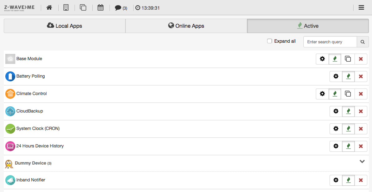
The tab for active app management is shown in Figure 4.14. It lists all active apps by app type. If there are more than one app of the same type (e.g. 'IF->THEN' is usually needed multiple times), the view is collapsed for this type of application but can be expanded. It is possible to expand all sections of multiple app types using the checkbox on the top. It is also possible to search for certain app names.
Every app line has a submenu with the following functions:
 : Stop this app
 : Allows cloning an app. This will open a dialog for a new instance of the
same app with the same settings. After saving these settings, the new app becomes active
and is shown in the list too.
: Allows cloning an app. This will open a dialog for a new instance of the
same app with the same settings. After saving these settings, the new app becomes active
and is shown in the list too.
 : Stop the App. It remains configured but is inactive. Once inactive,
the green flame changes into a red ON button to restart the app.
: Opens the configuration dialog. This is the very dialog to be completed
during the initial start of the app.
: Stop the App. It remains configured but is inactive. Once inactive,
the green flame changes into a red ON button to restart the app.
: Opens the configuration dialog. This is the very dialog to be completed
during the initial start of the app.
Please refer to Chapter 6 for more information on different apps.
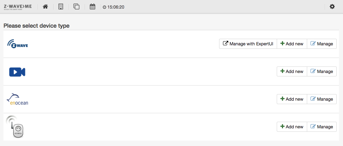
The device menu allows managing physical devices. By default, it offers two physical device types: “Z-Wave devices’’ and “IP cameras.’’ However, if other wireless communication technologies are activated, they will be shown as well. Please refer to Chapter 9 for more information on how to integrate further wireless technologies. This section will also explain how to include/exclude and manage these devices and IP cameras.
Figure 4.15 shows the device list including EnOcean and 433 MHz devices.
Therefore, let us focus here on managing Z-Wave devices. Besides the standard buttons to add and manage devices of the specific communication technology, Z-Wave offers one more button to link to a specific second Z-Wave user interface for installers and professionals. Please refer to Chapter 7 for a detailed description of this very technical, the so-called Z-WAVE EXPERT USER INTERFACE . Please note that all day-to-day management functions can be done without involving this very specific and technical interface.
In case the controller hardware supports the new Smart Start feature of Z-Wave, there will be another button to include new devices - the QR code san as sown in Figure 4.16.
Smart Start is a new way to include devices into Z-Wave using the QR code provided with S2 authentication. The user scans the QR code thats is stored in an internal so called provisioning list. Smart Start Devices will then announce to be included when powered up. In case the S2 key is in the provisioning list the controller will automatically include this new device without any further user interaction.
The button 'QR Code' opens a dialog to capture the Device Key, either by typing them in or by scanning the QR. Another menu tab allows managing the Device Keys already captured by not used for inclusion.
Please note that a standard web browser running on a standard PC may not provide the capability to scan QR codes.
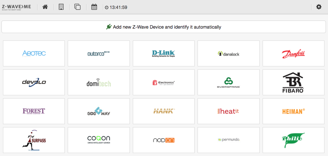
To include a new Z-Wave device (one of the first steps needed to start a smart home system!) please click on the + button on the Z-Wave device part. This will open an overview of current Z-Wave device vendors by name and logo. Figure 4.17 shows this overview.
Generally, there is no need to know the Z-Wave brand and product code. All Z-Wave devices are self-describing, and automatically identified products will provide the same functions as the devices that were pre-identified. Thus, experienced users will always click on the upper button to add a new unidentified Z-Wave device. The only reason to find a specific device from the list is to get some additional information on how to include this device. This refers to the button and the button push sequence needed for inclusion.
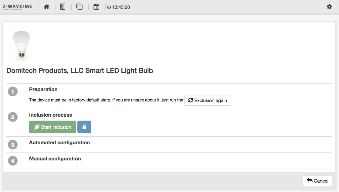
Since most Z-Wave devices have one Z-Wave inclusion button and single or triple click will do the inclusion, this information is only needed for some devices with exotic inclusion options. Both the buttons to include an unknown device and the right-hand side button of an identified button will lead to the same inclusion dialog as shown in Figure 4.18.

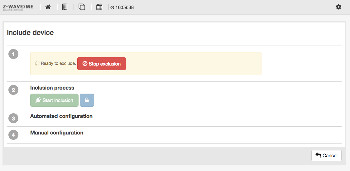
However, if you are sure that the device is new and in factory default state, you may skip this step. Right next to the inclusion button there is another small button that defines if the device will be included with special security functions. By default, the security option is enforced. However, some devices in the market may not work as expected using the security function. In case there is a connection problem, unsecure inclusion may still work.
Once the inclusion mode has been started, the controller waits for devices to be included. Figure 4.19 shows the controller at this moment. The inclusion mode can be terminated using the same button. Any new device included will also terminate the process.
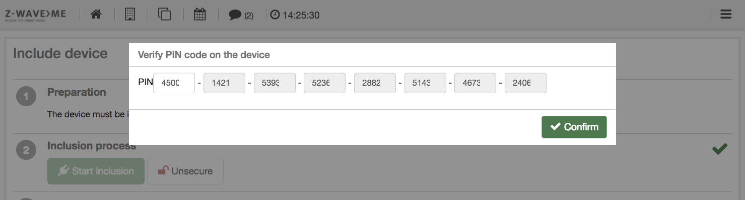
In case the new device requires authorization, this needs to be done right after inclusion. Authorization ensures that the device that appears on the user interface is indeed the device in hand. To ensure this the device offers either a QR code to be read or a device individual PIN number, both types of information need to be provided to the user interface manually. The controller will then match the information provided by the user with the information provided by the device using wireless communication. Only in case they match the device can be used.
Authentication is only required for certain devices. In this case, a window like that shown in Figure 4.21 pops up asking for the authentication information. Once given, they are checked. If authentication fails, a warning is displayed. It is not possible to just repeat the authentication. The device must be excluded and re-included.
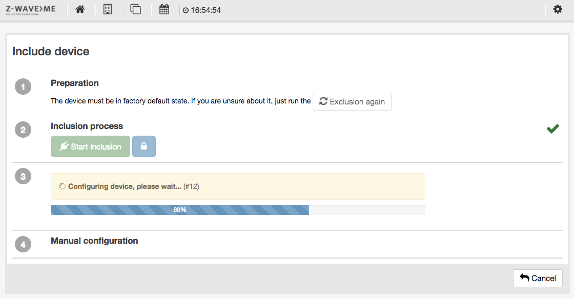
Any new device will be interviewed next. In this process, all functions announced by the device itself will be verified and certain user interface relevant data will be called from the device. A progress bar such as that in Figure 4.20 shows the status.
Once the interview was passed successfully, a dialog offers some initial manual configuration functions, as shown in Figure 4.18:
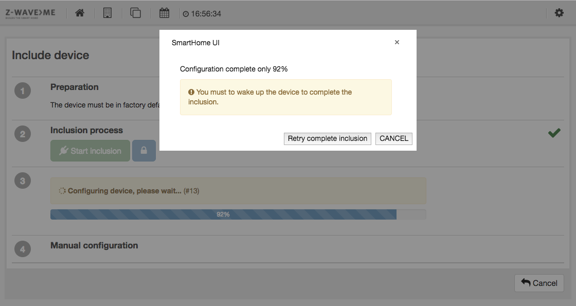
The interview process does not only detect all information from the device; it also tests the connectivity of the device. Certain communication may fail. Another good reason for such a failure is that a battery-operated device goes into deep sleep mode too fast. Figure 4.23 shows the error message in case of failure. In most cases, it’s OK to just redo the interview and wake up the device.
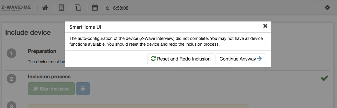
If the second attempt at the interview fails, the controllers gives the option to accept the result or to redo the entire process. Figure 4.24 shows this dialog box.
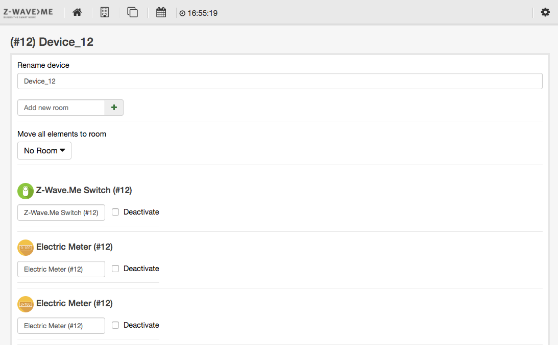
Once the interview has passed and all configurations are done, the device can be used.
The second option for Z-Wave devices besides adding (including) new devices is the device management menu. Clicking on the button Manage button opens a menu with three tabs:
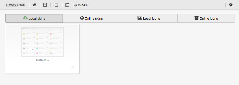
The customization menu option allows changing the look and feel of your Z-Way user interface. You can add more icons as device-specific icons and you can change the look and feel using skins. For more information on skins and how to create them, please refer to Chapter 10.1. This menu here only deals with skins that are already available.
The menu offers four tabs. The tab shown in Figure 4.29 shows the list of skins locally available. They can be activated by just clicking on the green activation button.
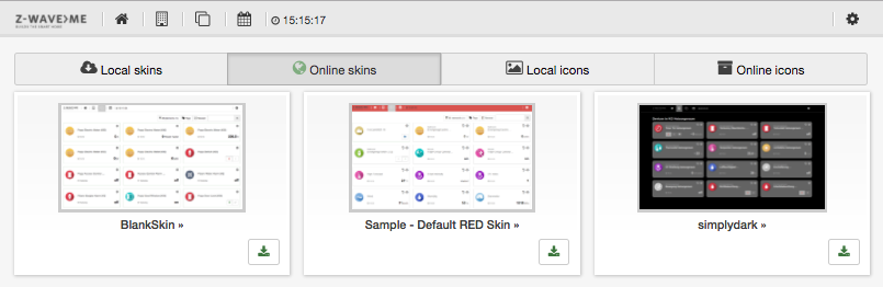
The tab shown in Figure 4.30 offers the list of skins available for download. They must be downloaded first before they can be activated and applied.
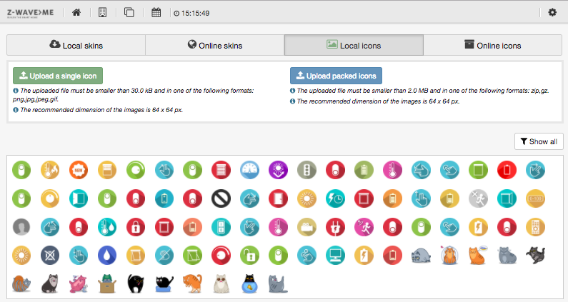
The tab shown in Figure 4.31 lists the additional icons available on the controller. They can be activated per element on the element configuration menu described in Chapter 4.1.1.
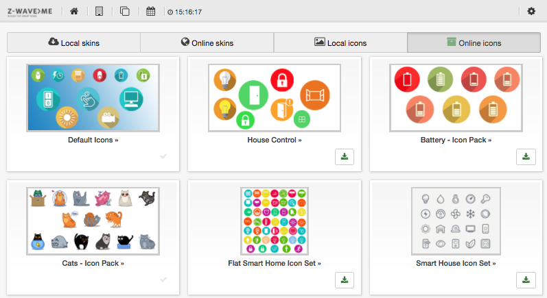
The tab shown in Figure 4.32 offers additional icon sets available on the server. They must be downloaded first before they can be activated and applied.
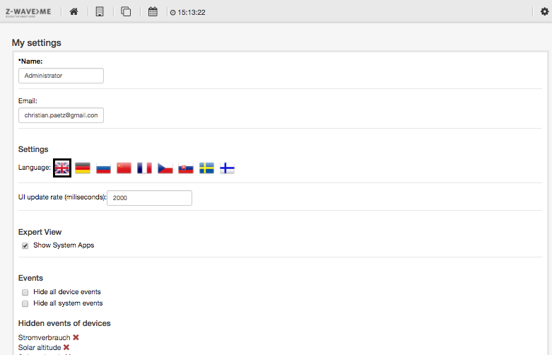
In this dialog, as shown in Figure 4.33, the local user interface settings for the logged in user can be changed.
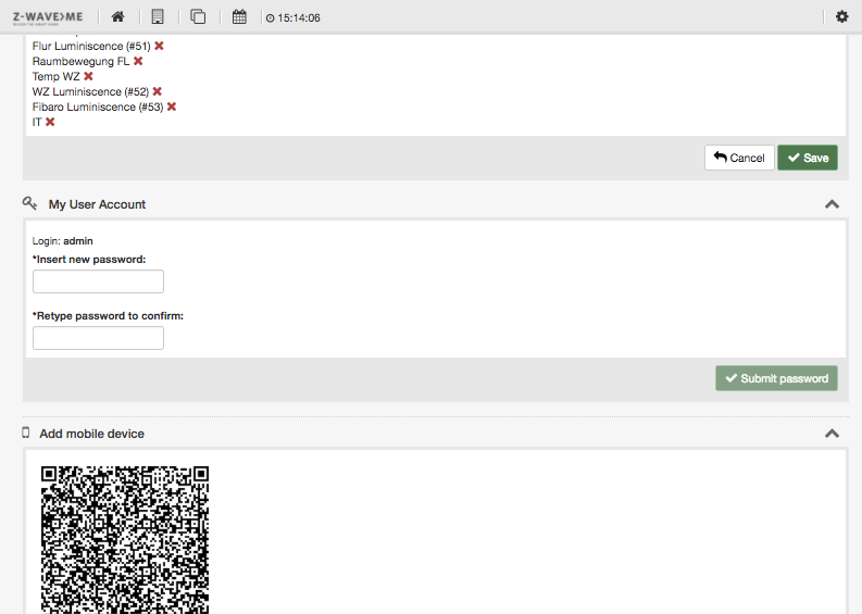
Figure 4.34 shows the lower part of the Settings dialog. In My User Account the individual password can be changed.
The section Add mobile device shows a QR code to simplify the setup. Please refer to Section 5 for more information on how to use this QR code.
The menu item Management opens a new menu with options to technically manage the platform. These management options are available for administrators only. Please refer to Section 4.3 for more information about the management options.
As shown in Figure 4.35, this dialog lists all news entries received from the RSS feed.
The logout button cancels the user sessions of the Z-WAY SMART HOME INTERFACE . In case of a login from
https://find.z-wave.me
the user is redirected to the find.z-wave.me overview page or else to the local login page.
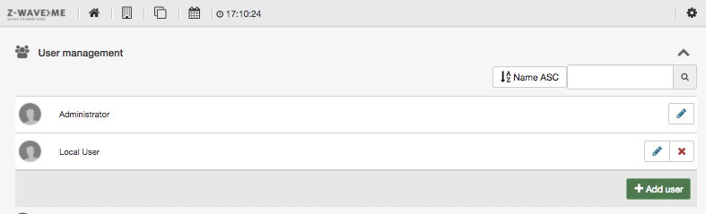
Figure 4.36 shows the controller management menu. Please note that this menu is available for users with administrator privileges only.
Figure 4.37 shows the list of users. It is possible to add more users, change their settings, and remove them. Clicking on the setup button opens the user setup dialog. It allows managing
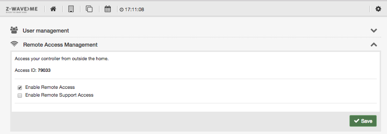
The dialog shown in Figure 4.38 allows managing the remote access functions of the controller. By default, the remote access function is activated. This enables accessing the controller from any end device in the Internet, e.g. a mobile phone. Please refer to Chapter 3.3 for information on how this remote access is implemented and what security implications this function has.
The remote support function is deactivated by default. This function allows support staff with access rights to the remote access server to remotely access your controller using remote shell (ssh). For complicated support issues, the support staff may ask to activate this function. Please make sure to deactivate it after the session. The remote ssh is only accessible to support staff with support infrastructure rights. Nevertheless, there is no good reason to keep a port open if not needed.
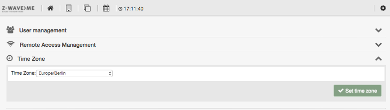
The dialog shown in Figure 4.39 allows managing the time zone of the controller. This ensures that all time stamps and the time clock on the top menu bar refer correctly to the local time at the location of the server. Please note that the time remains unchanged if you access the device from a browser from a different time zone.
Backup and restore can be done in two different ways:
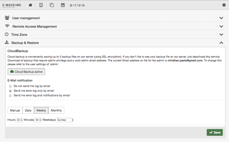
The first block of the Backup & Restore dialog controls the cloud backup, which can be activated or deactivated, as shown in Figure 4.40. When activated, the controller will automatically generate a backup file and send it to the cloud server using SSL encryption.
The files are stored on a server managed by Z-Wave.Me. This is a convenient way to keep and update a backup file—and its free of charge. However, if you don’t trust this server or the company, just don’t use cloud backup!
The cloud backup interface allows defining the backup interval and the notification in terms of failed or successful backup performed.
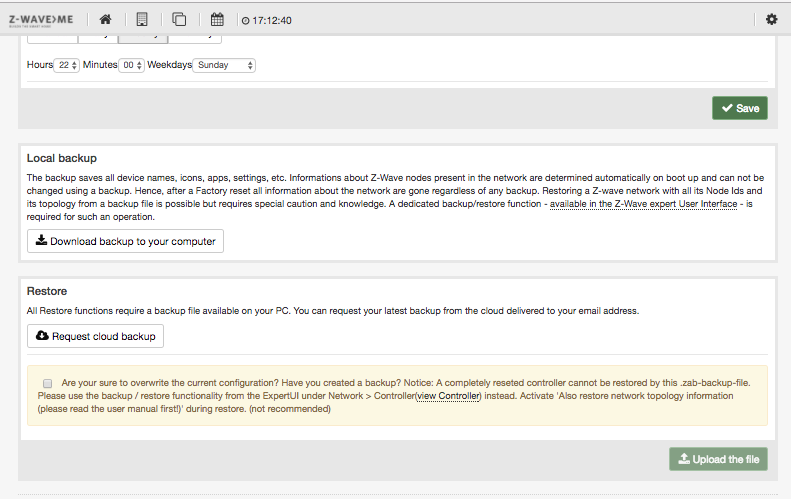
The local backup option, as shown in Figure 4.41, will generate a local backup file that needs to be stored on the local hard drive of the PC running the web browser. The file is identical to the file stored in the cloud. From the technical side, this is a ZIP file that can even be decompressed and audited. It will comprise XML and JSON files and images that were uploaded before.
If the cloud backup option was chosen, the backup file needs to be downloaded to the local PC before being applied as a restore file. Clicking on the button “Request Cloud Backup’’ will cause the server to generate a temporarily valid token which is sent by mail to the mail address defined for the admin account. This email will contain an explanation of the process and a unique link to an online list of backup files available. Just download the file of choice.
The real restore function always requires a file uploaded from the local file system. A checkbox ensures that the user understands the consequences of applying a restore file.
Please note that the backup and restore function will only handle files on the controller, and not the Z-Wave network topology stored in the Z-Wave transceiver chip.
To overwrite this content, please refer to the Z-WAVE EXPERT USER INTERFACE , as described in Chapter 7.5.1.
This function resets all functions of the controller. All uploaded images will be deleted and all given names and settings will be removed. The included Z-Wave devices will NOT be removed. For removing them from the controller, please refer to the basic Z-Wave literature, e.g. the book “Z-Wave Essentials’’ as mentioned in Chapter 1.
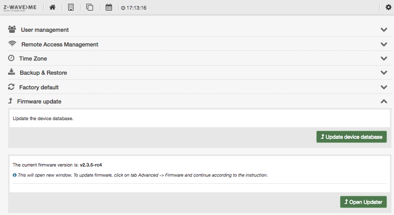
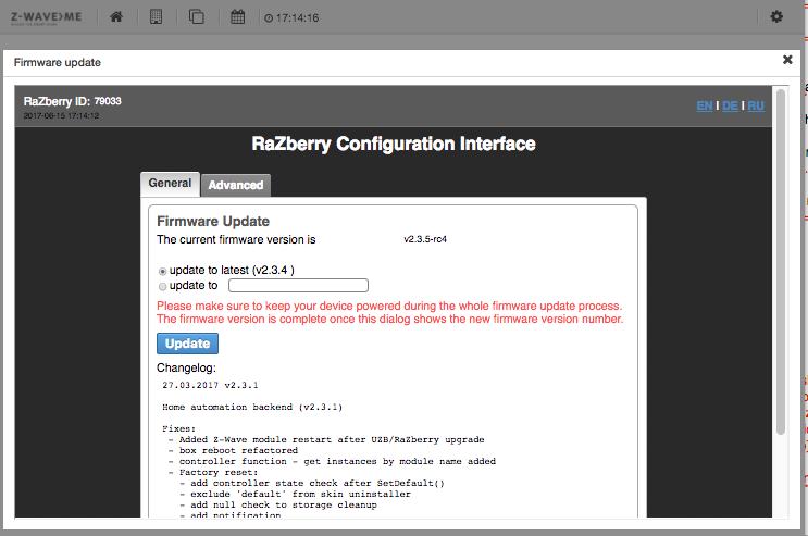
The firmware update menu as shown in figure 4.42 refers to two different processes:
Updating the firmware is a quite complex process. In the normal operation mode, all communication between user interface and controller backend is handled using IP Port 8083. However, there are good reasons not to use this port for the management of the firmware update:
This is why hitting the button Open Updater will open a new user interface embedded into the current interface. Figure 4.43 shows this new black-background user interface dedicated to the firmware update function. This user interface is served from another webserver temporarily active on IP port 8084. Hence, it would be possible to directly access this user interface using the
http://MYIP:8084.
This user interface will remain active for about 10 minutes. This is enough time to perform the firmware update and revert it in case of problems. After the 10 minutes, the service on 8084 is deactivated automatically.
The firmware update dialog shows the current firmware and offers update to the most recently released firmware version. For debugging or trouble shooting purposes, it is possible to load a specific firmware version. A change log shows the changes of all the official firmware release versions.
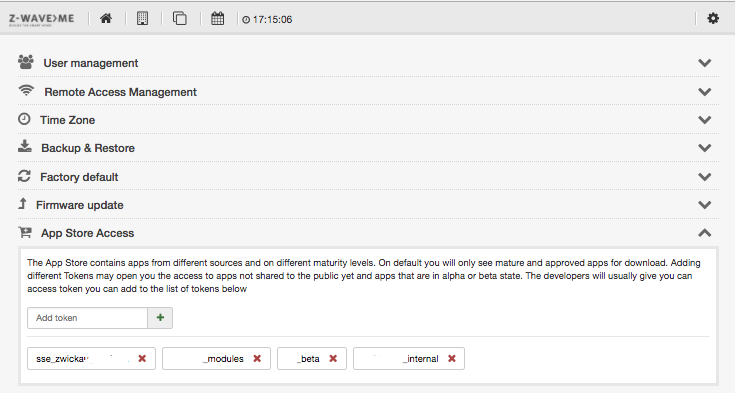
The app store allows downloading new apps provided either by Z-Wave.Me or other independent developers. Some of these developers may want to limit the use of their apps to a certain group of people, either because this is related to their business model, or because the apps are beta stage or for trial only.
The token concept is a simple and efficient method to limit access. Apps that are uploaded to the app server (For more information on how to create and upload apps, please refer to Chapter 6) can be marked with one or more tags. These tags are simple strings and the developer can choose whatever token he wants. He can also have more than one tag for different purposes.
In order to access apps that are tagged, the various tags need to be added to the controller using the form shown in Figure 4.44. Tags can be added and removed. Once a tag is added, all the apps with this tag will be shown in the app store, as described in Section 4.2.1.
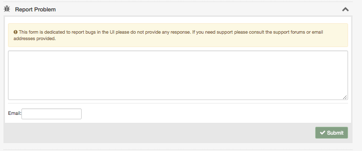
The menu item, as shown in Figure 4.45, demonstrates a quick and simple way to report bugs and problems related to this User Interface. Providing an email is optional, but please be aware that the form will transmit some meta data such as version number of the User Interfaces or version number of the firmware. If you don’t like to share such information, please use your personal email. Also, please don’t expect an individual answer to the bug reports. This is not a support tool.
The info menu item provides some version information for the user interface and the
backend. This information is usually needed for support and troubleshooting purposes only.